Since 2017, The Rolling Barrage has had various redesigns of its appearance on the web, notably in its design. The options available with web design coupled with the various technologies that are present for the consumer range from desktop, laptops, tablets to smart phones can be extensive.
The software platforms, Windows, IOS, and Android with the browser options can provide great experiences but also challenges.
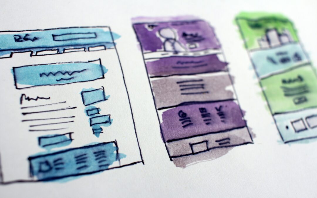
In preparing for 2023, the website took a dramatic shift in terms of design. While it provided overall an increased shift in terms of providing information, and transparency to the organization, it was also graphic wise heavy.
In reviewing the analytics of how users interact with the website and more importantly the devices they use to interact with the website we found the following:
- desktop / laptop interaction – October to June – ranged between 55% – 65%
- mobile devices interaction – October to June – ranged between 35% – 45%
- desktop / laptop interaction – July – Sept – ranged between 20% – 40%
- mobile devices interaction – July – Sept – ranged between 60% – 80%
The lead up to The Rolling Barrage ride, the actual ride period and afterwards shows a substantial increase in mobile device usage. Makes sense considering this period is optimal for riding, our website directly is aimed towards motorcycle riders, and generally speaking the consumer overall is gravitating more towards mobility options.
With that the challenge became, how do you present and provide the information you need to present and acknowledge increased mobility use but also still provide graphic elements that don’t bear down hard when accessing on a smart phone for example.
There is a trade off realistically with the standalone graphic elements that compliment the written word or information presented. With that in mind, the majority of pages on the website have been stripped of standalone graphics. They are now imbedded within a textual based concept as an accent thumbnail.
Galleries on some pages have been added where displaying multiple images are important. If you are on a desktop, laptop or a tablet, you can click on the graphic in a gallery and it will expand using Lightbox. On a phone, you don’t really have to do that.
The big change came right on our Home page. The slider is gone. It looked good on a desktop or laptop and some tablet devices but never displayed properly on a phone device. The redesign of that page still has graphic elements and links that take the user to very specific pages within the website. They can be changed, adjusted to promote certain aspects of the website and organization.
The website on a mobile device will still bear the scroll effect for mobile devices. But removing the heavier standalone graphics that were present in the previous design mostly has probably reduced the page scroll on a mobile device about 20% – 30% depending on which page you are viewing.
There will still be some minor adjustments in the weeks ahead, but for the most part, the redesign is completed. As information for The Rolling Barrage VIII – 2024 rolls out, it will be added with the redesign in mind.
More additions will come soon such as photo galleries specific to The Rolling Barrage VII 2023 ride. 2023 was an exciting year. We expect that 2024 will be the same. Hopefully, better weather, but that didn’t stop us either.
Just in case you are all wondering.. when is the next Rolling Barrage taking place? Our count-down is active on the Home page. We are at 316 days and counting to KSU.
Cheers,